Best Format for Printing Photos: TIFF, PNG, JPG or PDF
You sent a photo to print — and on paper the colors faded, grain crept in, and the shot looks worse than it did on screen. The cause is almost always three things: the wrong format, low resolution and RGB/CMYK confusion. Let's break down exactly what to hand the print shop and photo lab so the result doesn't disappoint.
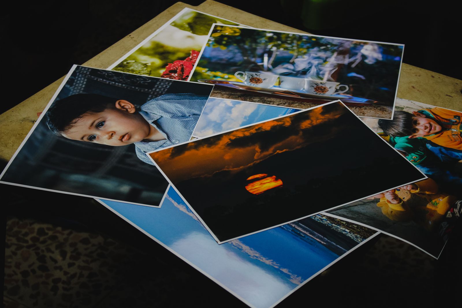
The core difference between print and screen
Screen and paper are two completely different worlds. A monitor emits light: it mixes red, green and blue light, which lets it show juicy, vivid colors. Paper emits nothing — it reflects light, and the image is built from a layer of ink. So what blazes on a screen looks calmer and darker on a print.
Everything else follows from that. Print cares about three parameters you barely notice on screen: the file format (does it keep all the detail), the resolution (are there enough pixels for the target size) and the color model (how the colors translate into ink). Let's take them one at a time.
In short
Print forgives less than the web. A heavily compressed file, low resolution or "screen" colors show up instantly on paper. So for printing you hand over the highest-quality source, not the "light" web version.
Print formats: TIFF, PNG, JPG, PDF
Each of these formats solves its own task. Here's how they line up:
| Format | Compression | When to use |
|---|---|---|
| TIFF | Lossless | Professional print, covers, anything that will be edited |
| PNG | Lossless | Graphics with sharp edges, text, transparency in a layout |
| JPG | Lossy | Everyday photo printing when you want a light, good file |
| Depends on content | Finished layouts: cards, brochures, posters, multi-page docs |
TIFF is the gold standard of quality print. It stores the image with zero loss, supports layers and deep color, and every print shop accepts it. Its one downside is the large file size.
JPG is the workhorse of everyday photo printing. Yes, it's lossy compression, but at maximum quality the difference from TIFF on a 4×6 or 8×12 print is practically invisible, while the file is many times lighter. For family photos it's an excellent pick.
PNG is the right call when the layout has sharp graphics, text or transparent areas: it keeps crisp edges without artifacts. For a pure photograph it's overkill.
PDF isn't an image format but a whole-layout one. If you're printing a business card, brochure or poster with text, positioning and several elements, PDF bundles it all into one reliable file that the print shop opens with no surprises about fonts or placement.

DPI and why you need 300 dots
DPI (dots per inch) is the density of dots when printing. The more of them per unit of area, the finer the detail and the crisper the print. The industry standard for quality printing is 300 DPI: at that density the human eye can no longer pick out individual dots and the shot looks smooth.
Here lies a common trap. Screen images usually have just 72 DPI — enough for a monitor, but catastrophically low for paper. Take a web image and print it large, and the result will be grainy and blurry. So printing always needs a high-resolution source.
You can't stretch it
You can't "pull" a small image up to quality just by enlarging it: there won't be more pixels, they'll just get bigger and more visible. Resolution is baked in at capture or file creation — it can't be added after the fact.
A simple rule: to find the biggest size you can print at 300 DPI, divide each side's pixels by 300. A 3000×2000 photo (3000÷300 = 10, 2000÷300 ≈ 6.7) prints cleanly up to about 10 by 6.7 inches — roughly a standard 10×8 print.
RGB vs CMYK: where bright colors go
This is the second big source of disappointment. RGB is the color model of screens: they mix light of three colors (red, green, blue) and can show very saturated tones. CMYK is the print model: the shop mixes four inks (cyan, magenta, yellow and black).
The catch is that inks physically can't reproduce all the bright colors that glow on a screen. So a saturated neon blue or an acid green will inevitably dull down in print — that's not a defect, but a limit of the technology itself.
What to do about it in practice:
- Professional layouts (publishing, packaging, advertising) are prepared in CMYK from the start — so you see the real print colors on screen and avoid surprises.
- Home and everyday photo printing works fine from RGB: your home printer or the photo shop's machine does the conversion to ink itself.
- If color is critical — ask the print shop in advance which model to deliver in, and request a color proof.
What to choose for your job
Let's roll it into a simple cheat sheet:
| What you're printing | Format | Note |
|---|---|---|
| Family photos, photo album | JPG (max quality) | 300 DPI, RGB — the lab converts it |
| Professional print, exhibition | TIFF | Lossless, confirm CMYK ahead |
| Poster with graphics and text | PNG or PDF | Sharp edges without artifacts |
| Business card, brochure, poster, menu | Text and layout in one file |
Prepping a photo for print? Convert it to TIFF
FormatZ converts JPG to lossless TIFF right in your browser — exactly what quality print shops want. No software to install, no sign-up.
Convert JPG to TIFFHow to prepare a file for print
The final routine before sending to the print shop:
Use the source
Use the highest-resolution original, not a shrunken copy from social media or a messenger.
Check size and DPI
Make sure there are enough pixels for the target size at 300 DPI.
Pick the format
Photo → TIFF or a quality JPG. Layout with text → PDF.
Confirm color
For serious print work, ask the shop about CMYK and a color proof.
If you need to assemble a layout as PDF (e.g. turn an image into a print-ready file), use JPG to PDF and PNG to PDF. The full list of conversions is on the all formats page.
Frequently asked questions about print formats
Read next
 How-to
HEIC from iPhone: Why It Won't Open
Why photo printers reject HEIC and how to turn it into JPG.
 Comparison
Transparent Background: PNG vs WebP vs SVG
Which format keeps transparency for a layout and a logo.
 Comparison
Best Image Format for Web 2026
AVIF, WebP or JPG: what to put on your site and why.