Color in Photoshop: RGB, CMYK and Profiles
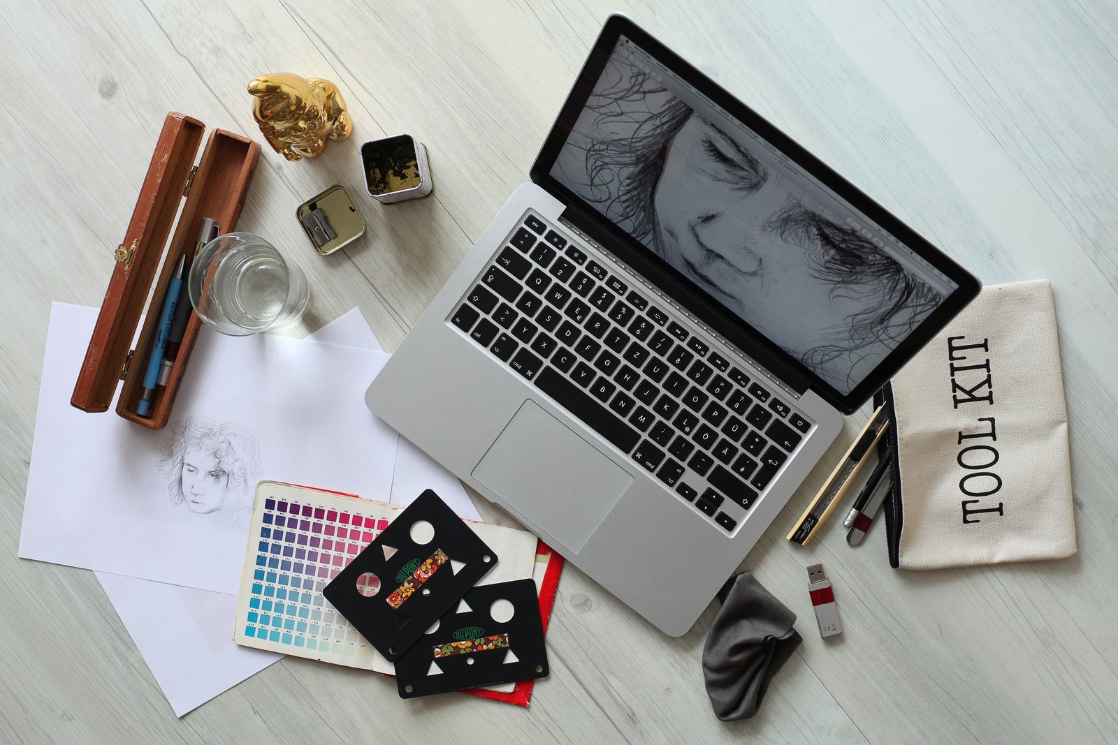
A punchy scarlet logo on screen, but a dull brick-orange on the business card. Familiar pain? The thing is, the screen and print speak different languages of color. Let's decode RGB, CMYK and profiles so that what you see finally matches what you get.

Color from light vs color from ink
Every color difference in Photoshop comes down to one question: does the color glow or does it reflect?
RGB is color from light. A screen is made of tiny red, green and blue dots that glow and mix. When all three blaze at maximum, you get white. It's an additive model (colors add up toward light). RGB is the mode for anything viewed on a display: websites, social media, video, presentations.
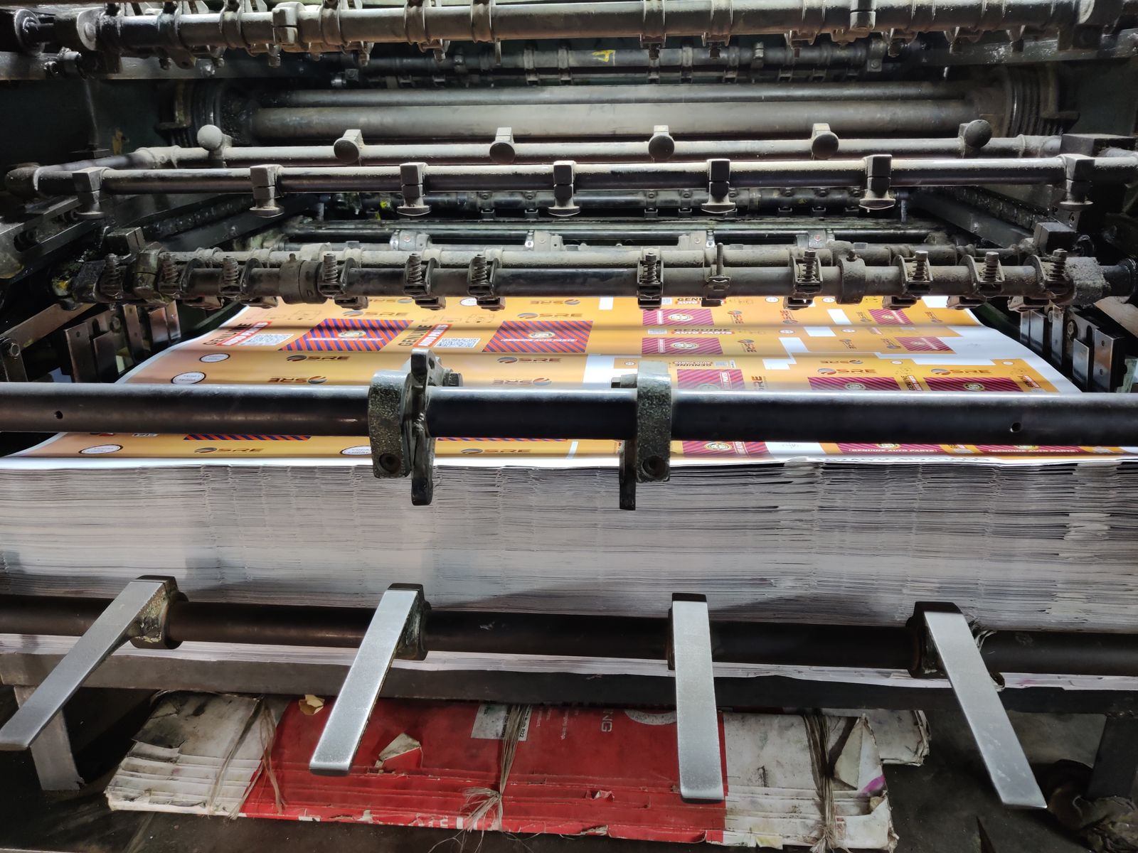
CMYK is color from ink. A print shop lays four inks onto white paper: cyan, magenta, yellow and black (Key). Ink doesn't glow — it absorbs some light and reflects the rest. The more ink, the darker. It's a subtractive model. CMYK is the mode for print.
| Trait | RGB | CMYK |
|---|---|---|
| Nature | Light (glows) | Ink (reflects) |
| Channels | Red, green, blue | Cyan, magenta, yellow, black |
| Model | Additive (toward white) | Subtractive (toward black) |
| Where it's for | Screen, web, video | |
| Color gamut | Wider, brighter | Narrower, muted |
Why colors "fade" in print
RGB's gamut is wider than CMYK's: a screen can glow brighter than ink can reflect. So the most vivid neon colors are physically unreachable in print. When converting RGB → CMYK, Photoshop mutes them to the nearest printable ones — and that's normal, not a bug.
Not all RGB is equal: sRGB, Adobe RGB, ProPhoto
"RGB" isn't one space but a whole family. They differ in gamut — how vivid a range of colors they can describe.
- sRGB — the narrowest but most universal. It's the standard for the web and most screens. Anything going online should be sRGB — otherwise the colors drift in the browser.
- Adobe RGB — wider than sRGB, especially in the green-cyan region. It's favored for professional print, where a rich gamut matters.
- ProPhoto RGB — a huge gamut covering nearly all visible colors. Used for editing RAW in 16-bit as a "working" space with maximum headroom.
That's exactly why an image from wide Adobe RGB looks dull if you post it to the web as-is: the browser treats the colors as sRGB. How one export checkbox fixes this is covered in "How to Export from Photoshop for the Web".
ICC profiles: a file's "color passport"
Here the key concept surfaces — the ICC profile. The easiest way to think of it is a "color passport" attached to the file.
On its own, a triplet like "R=200, G=50, B=50" means nothing without context: on one screen it's one red, on another a different one. The ICC profile locks in the exact meaning of those numbers: "this specific red is what was intended." A profile can belong to a space (sRGB, Adobe RGB) or to a specific device — your monitor or the print shop's press.
When a file carries an embedded profile, any color-managed program shows it correctly. Lose the profile and the color becomes "passport-less": everyone renders it however they like.
Assign vs Convert: the big mix-up
Two menu items (Edit → Assign Profile and Edit → Convert to Profile) sound alike but do the opposite. Confusing them is the source of half of all color trouble.
Assign Profile
The pixel numbers stay the same, but their interpretation changes. The image visibly changes. Use it when the profile is missing or wrong and you need to "tell" the file the truth about its color.
Convert to Profile
The pixel numbers are recalculated so the appearance stays the same in the new space. Use it to switch spaces without ruining the look — for example, from Adobe RGB to sRGB before publishing.
Easy to remember
Convert = "keep the look, change the numbers" (the everyday workhorse). Assign = "keep the numbers, change the meaning" (the emergency tool, when the profile is wrong). To move to sRGB for the web, you almost always want Convert.
Soft proofing and the gamut warning
How do you see the future print before sending it off, without wasting paper? That's what soft proofing is for.
Under View → Proof Setup, pick the profile of the intended print (or "Working CMYK"), and Photoshop shows on your monitor how the RGB image will look in that CMYK. The vivid on-screen colors mute a little — that's a simulation of what ink can really do.
The second tool is the Gamut Warning (View → Gamut Warning). Photoshop highlights in gray the pixels whose colors print can't reproduce. Seeing those zones, you mute them by hand in advance — and there's no nasty surprise in print.

8 or 16 bit: headroom for corrections
Another color setting is bit depth. It sets how many levels are stored in each channel.
8-bit is 256 levels per channel. For a finished on-screen image that's plenty: it's about all the eye distinguishes. 16-bit is thousands of levels. There's almost no visible difference, but it gives huge headroom for heavy corrections: lifting shadows, working with gradients, big tonal shifts.
Why does it matter? Under aggressive edits in 8-bit, smooth transitions (a sky, a gradient) can develop banding — posterization. In 16-bit there are enough levels to keep the transition smooth. In practice: edit important shots and RAW in 16-bit, then convert to 8-bit before exporting to JPG or PNG (Image → Mode). This ties directly into RAW development — more in "Camera Raw in Photoshop".
Simple everyday rules
So you don't have to hold all the theory in your head, here's a quick cheat sheet.
- Work in RGB almost always — it's more flexible and wider. Convert to CMYK only at the very end, for a specific print.
- For the web — sRGB. Before publishing, do Convert to Profile → sRGB.
- For print, ask the print shop for its CMYK profile and check the layout with soft proofing.
- Important edits in 16-bit, finished export in 8-bit.
- Embed the profile when saving, so the color doesn't "lose its passport."
Prepping a layout for print or sharing?
Assemble a PSD into a PDF right in the browser — a handy format for the print shop and for sign-off. The FormatZ converter works with no Photoshop install and no sign-up.
Convert PSD to PDFHow to get a file to the print shop by the book — 300 DPI, CMYK, bleed — is in "Preparing for Print in Photoshop". Every PSD conversion is on the all formats page.